Tags: Asperand, Design, Mance Creative
Here’s Lookin @ You!
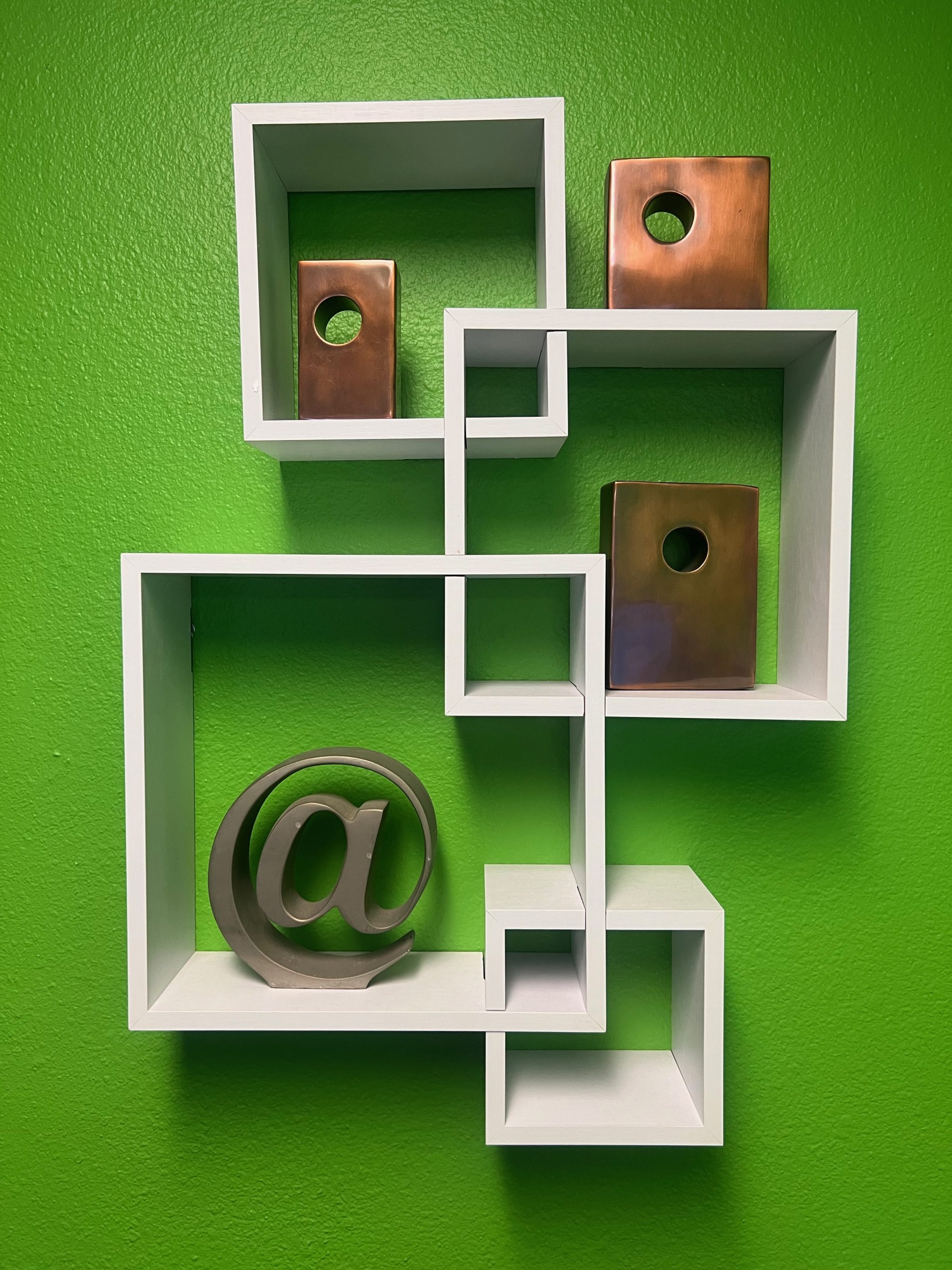
As you enter the Mance Creative offices, you might notice this sculpture of the asperand on our shelf. The asperand (@ symbol) is commonly used today as the “at” in emails and on social media platforms, but its roots are fairly old.
It’s first known use dates to the 16th century when merchants used it to indicate the price per unit of something sold. So if wine was being sold at $12 per bottle, it would be “$12 @ bottle”.
The @ symbol fell out of common use for a while until computer programmer, Ray Tomlinson, needed an uncommonly used … Read More
Tags: Asperand, Design, Mance Creative
Here’s Lookin @ You!
As you enter the Mance Creative offices, you might notice this sculpture of the asperand on our shelf. The asperand (@ symbol) is commonly used today as the “at” in emails and on social media platforms, but its roots are fairly old.
It’s first known use dates to the 16th century when merchants used it to indicate the price per unit of something sold. So if wine was being sold at $12 per bottle, it would be “$12 @ bottle”.
The @ symbol fell out of common use for a while until computer programmer, Ray Tomlinson, needed an uncommonly used … Read More
Color Inspo
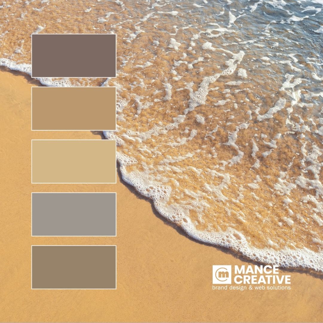
This great shot of the intersection between sand and sea makes a surprising color palette of rich tans, shadowy browns, and an ultra-cool gray. This versatile palette could be used in almost any industry, setting a strong branding foundation for anything from a modern beauty startup to a longstanding accounting firm! How it’s done is all a part of the process. Visit our website to check out our Case Studies & see how we use colors to help our brand stand out amongst the crowds!
Ringing in the New Year!
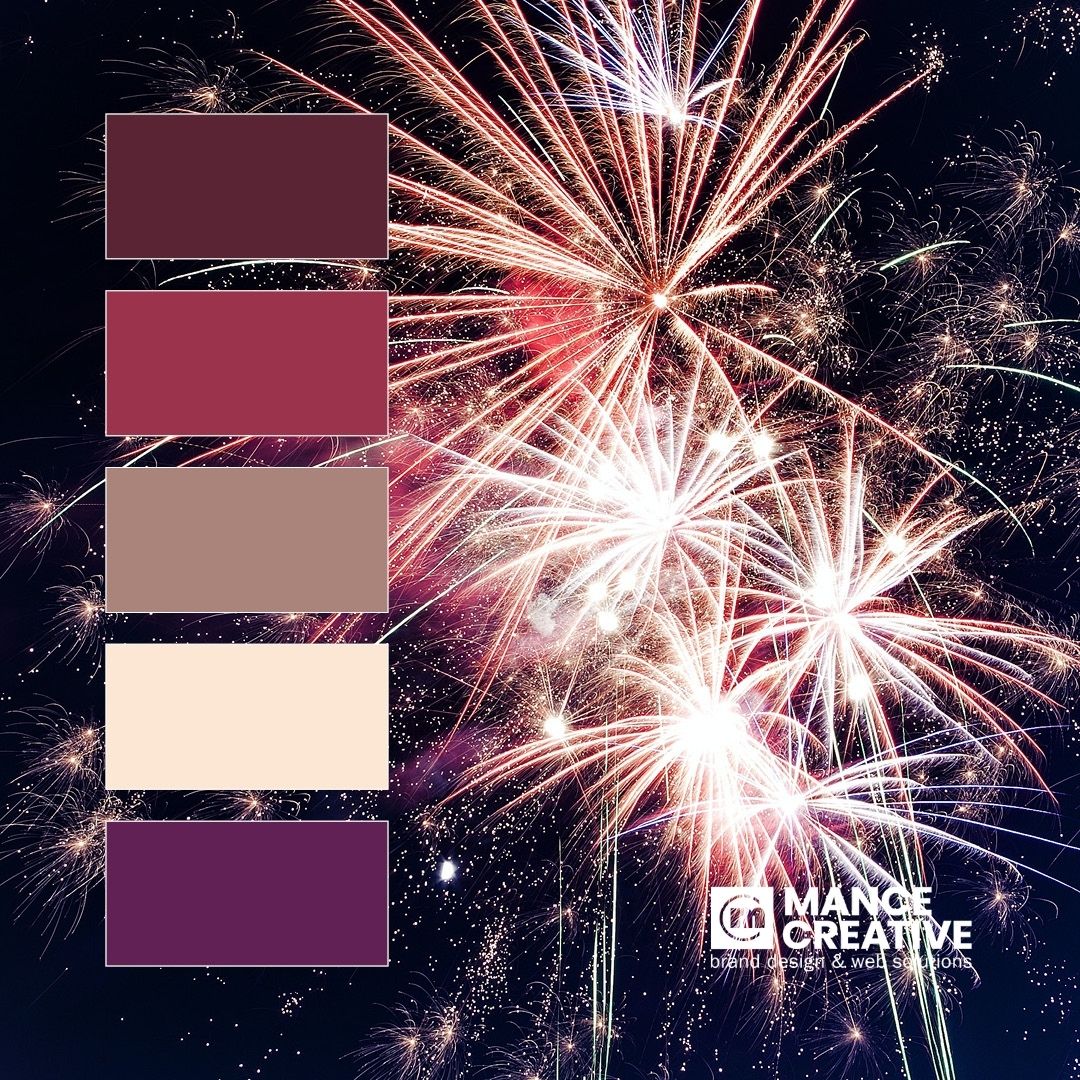
Happy New Year from all of us here at Mance Creative!
DID YOU KNOW? Rather than get their bright colors from pigments like paint or “smoke bombs”, fireworks get their colors from CHEMISTRY! In addition to the chemicals necessary for their controlled explosions, fireworks contain specific metal salts that dictate the colors we see when they go off (like copper salts for blue, calcium salts for orange, and barium salts for green!)
Holiday Inspo
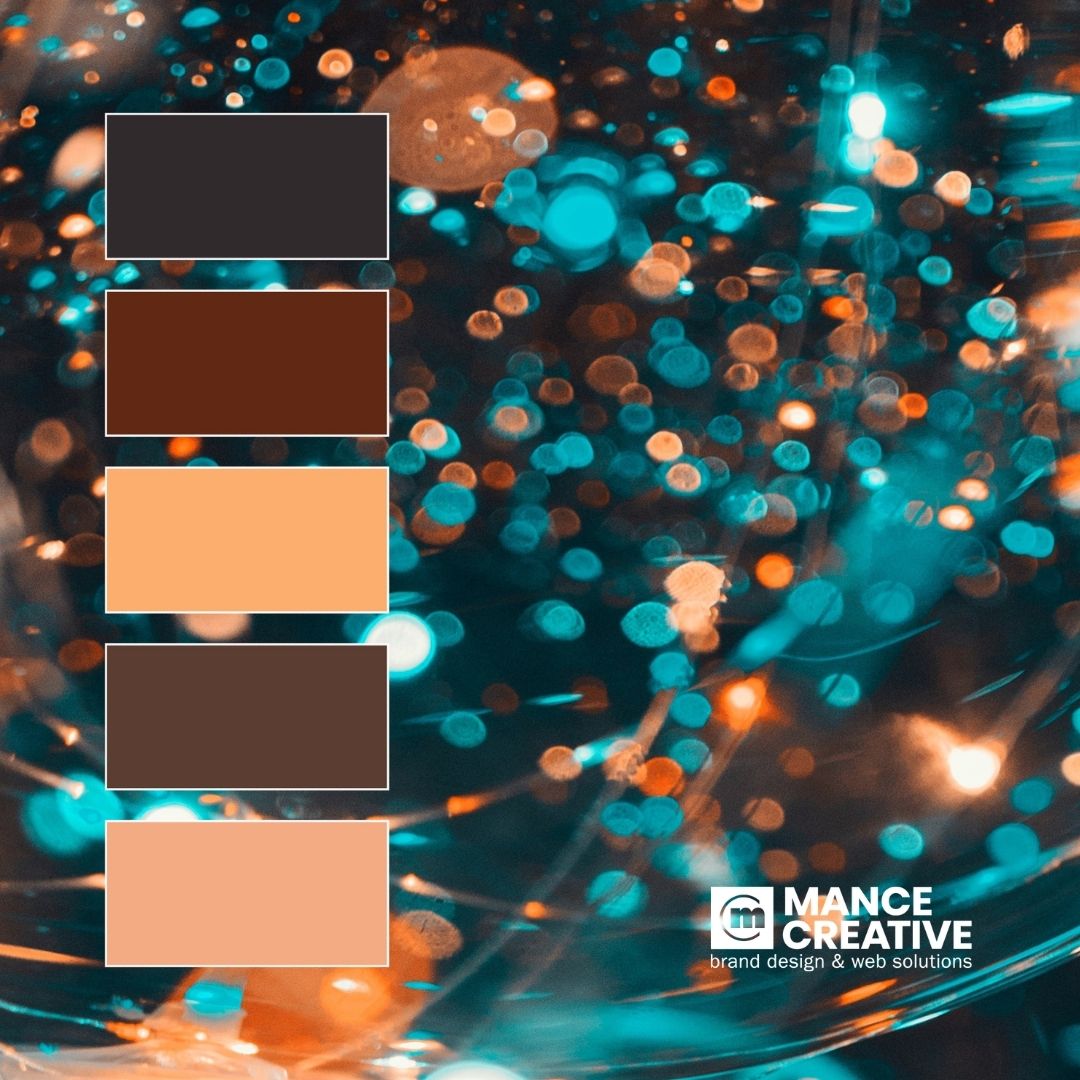
This glitter & bokeh shot has us ready for those upcoming Holiday Parties! While the whole image feels lively and energetic, the color scheme is surprisingly subdued without that bright, hot blue (as you can tell with these swatches). Follow us on our Instagram account @mancecreative to beautify your feed with more daily color inspo and see some of our latest client work!
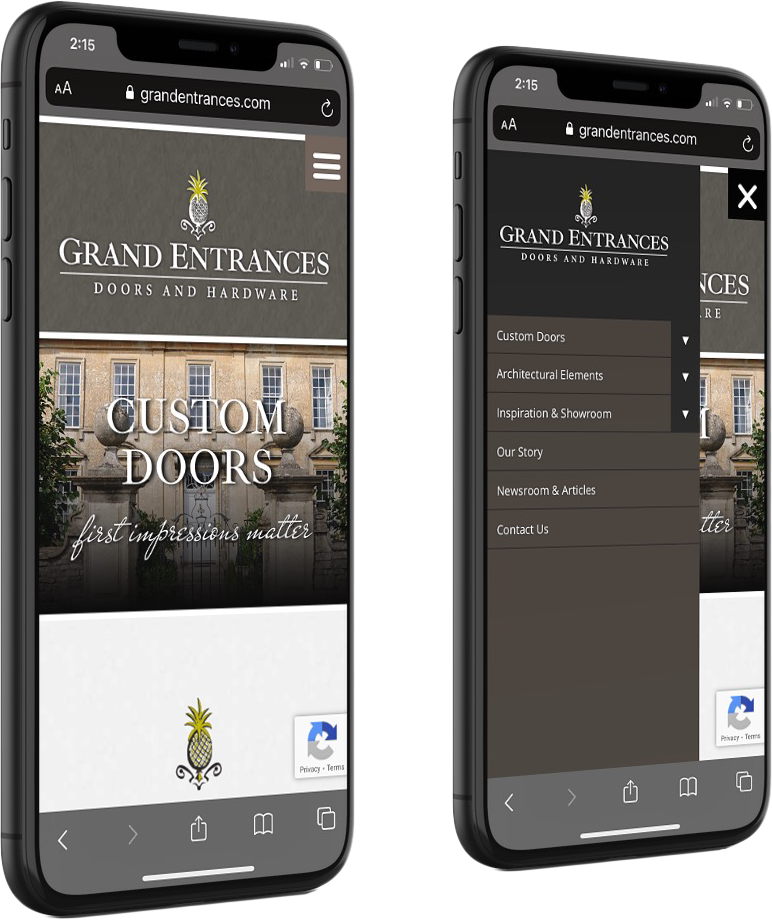
Mobile-Friendly Website Design
Shades of Autumn
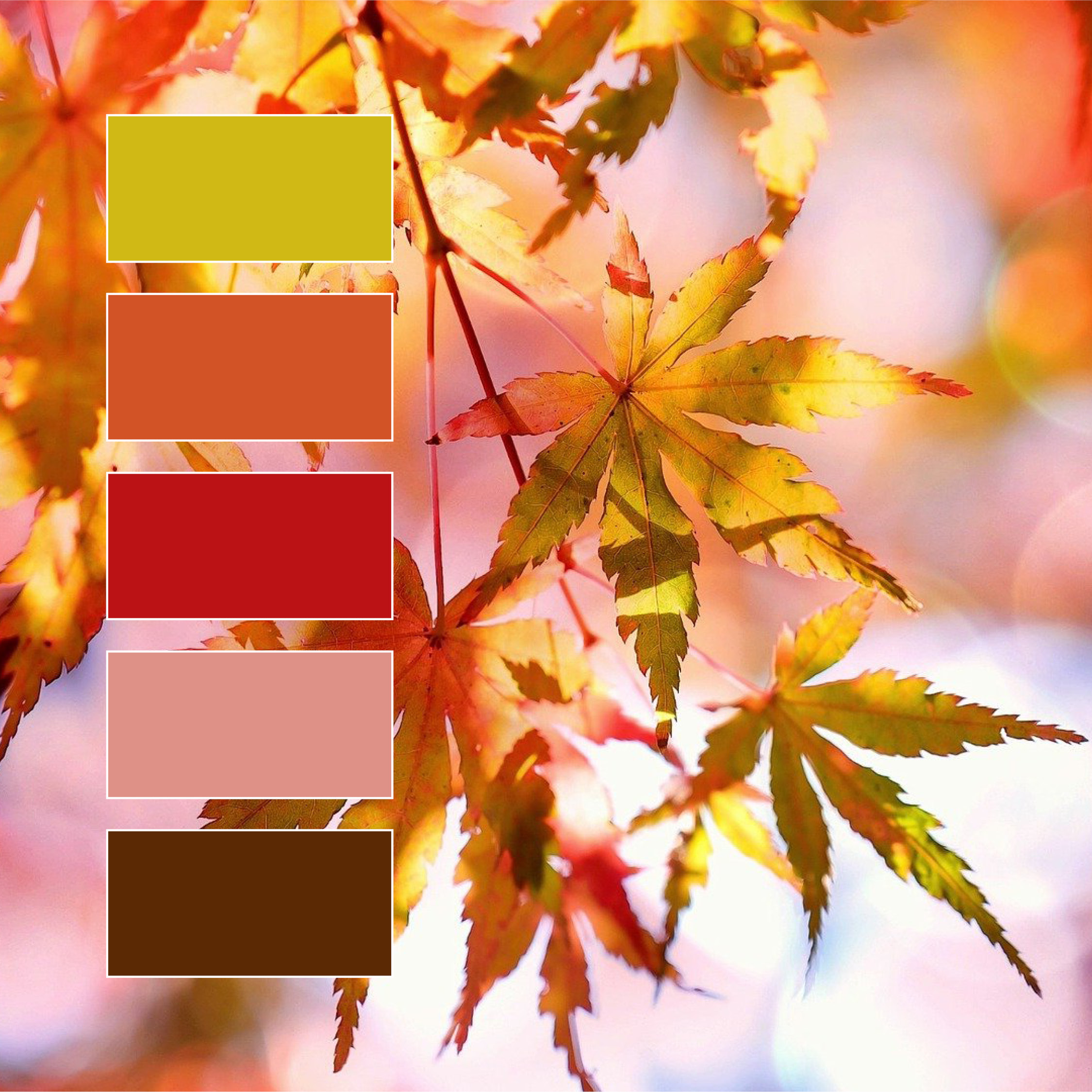
Fall is in the air!
Every year, we fall back in love with fall 🍂 The trees’ changing colors offer a beautiful new color palette with each passing day, the above being one of our all-time favorites (red AND chartreuse?! Woah!) What are some of your favorite fall colors?
Shades of Green
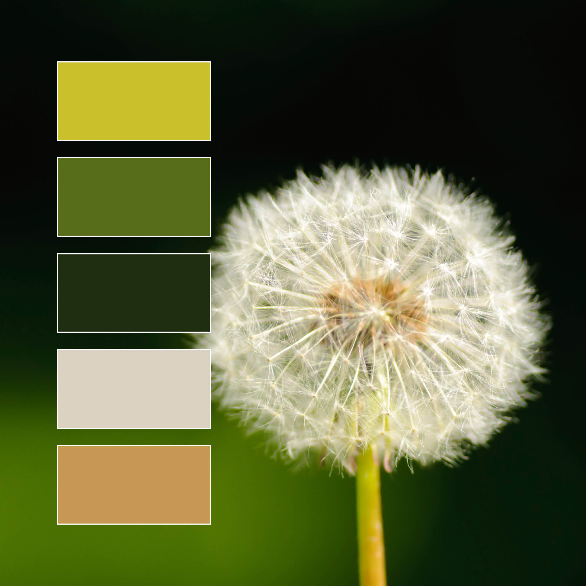
We love this color palette! While its made of mostly greens, a wide variety of shades and hues provides plenty of diversity and interest to the overall image. The bright camel and dusty white create strong contrast with the chosen greens, with each color sharing a subdued quality that highlights the natural harmony of the composition.
While green is on the cool end of the spectrum, its “temperature” is unique due to its status as a secondary color between two primaries; yellow and blue. This means the temperature of a green hue will vary greatly depending on which primary color … Read More
Design Tips: Color in Branding & Marketing

Why Green Should Be Your New Favorite Color!
The next color in our Design Tips: Color Themes series is our personal favorite; GREEN! Okay, maybe we’re a little bias, but there’s a good reason our Creative Director [Michael Mance] chose a monochromatic green color palette for Mance Creative. “Men tend to like cooler colors while women tend to like warmer colors. The color that they both agree on is green.” So, green was chosen to appeal to the widest possible audience. In addition to being equally eye-catching regardless of gender, green communicates balance, freshness, and innovation — All qualities we … Read More
The Power of Color

Did you know that the Pantone color of the year is Illuminating Yellow and Ultimate Gray? Yellow symbolizes happiness while Gray stands for strength and a solid foundation. These two colors combined give us the feeling of HOPE this year. Color has power and can be used in your branding strategies to evoke a certain mood, capture your audience’s attention, or show off your brand’s personality!