Shades of Autumn
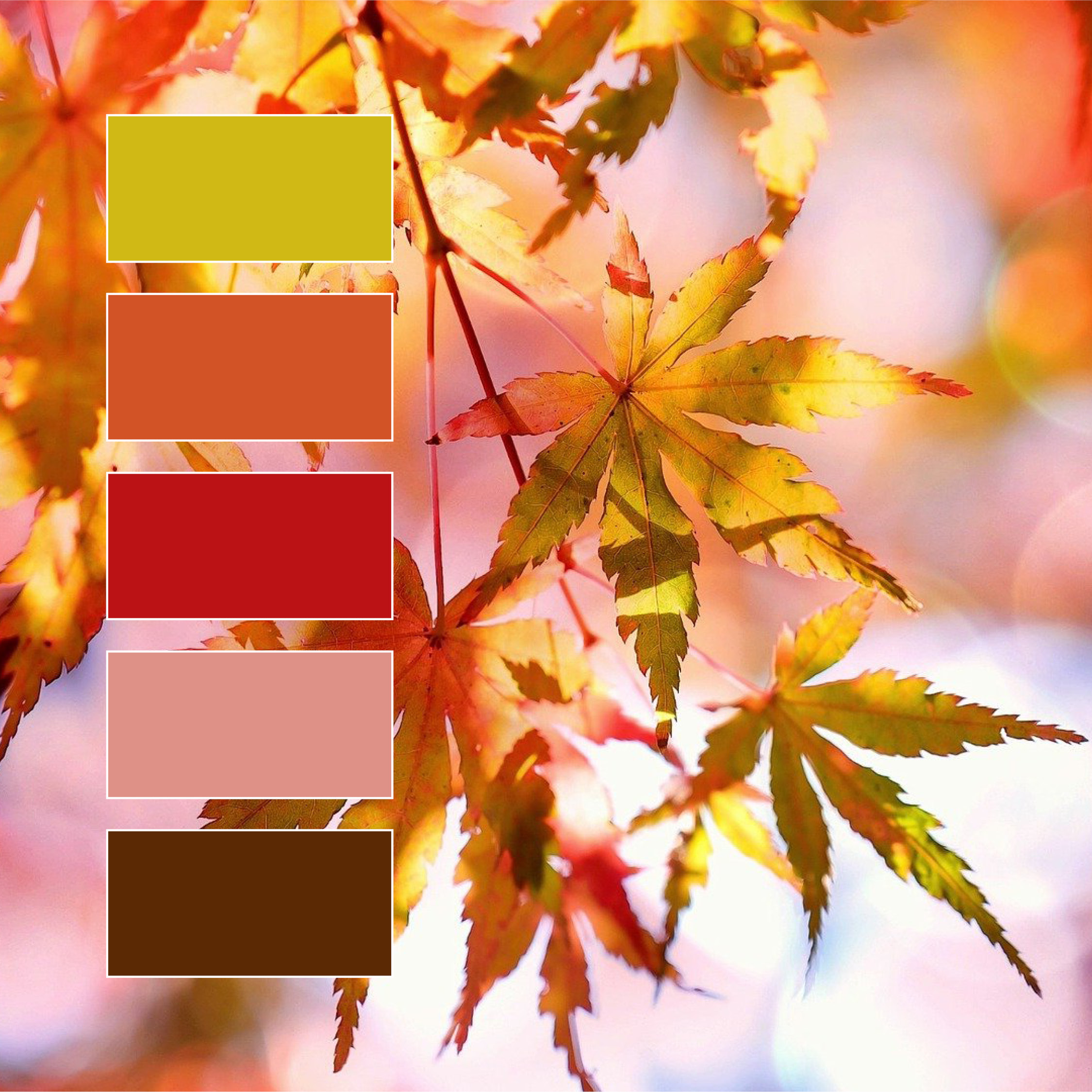
Fall is in the air!
Every year, we fall back in love with fall 🍂 The trees’ changing colors offer a beautiful new color palette with each passing day, the above being one of our all-time favorites (red AND chartreuse?! Woah!) What are some of your favorite fall colors?
Social Media Branding
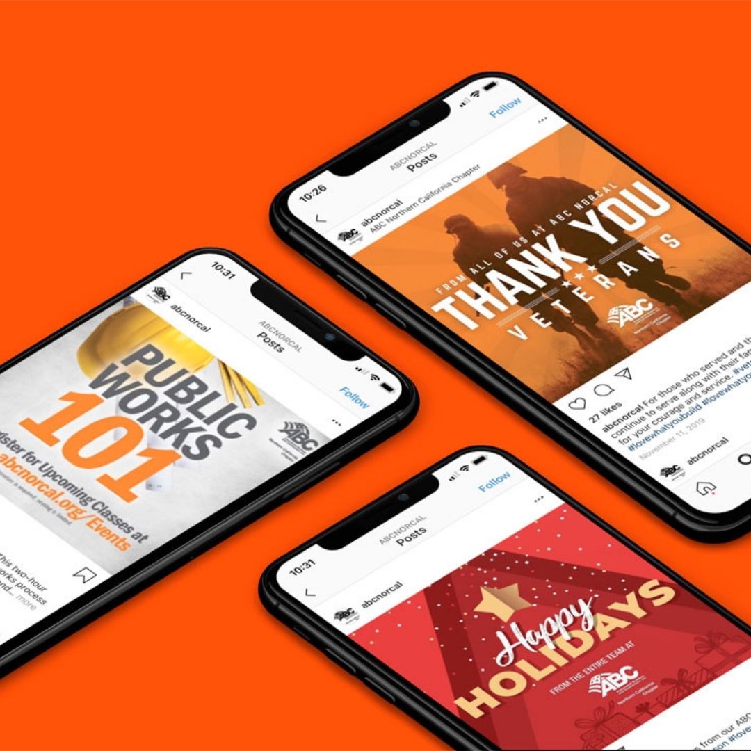
Social media branding is about consistently using the right methods to engage with your target audience on social media platforms. DID YOU KNOW? We can help your brand stay consistent across all channels and platforms. Send us a message to hear more about our print, web, and social media services!
Dance Is In The Air
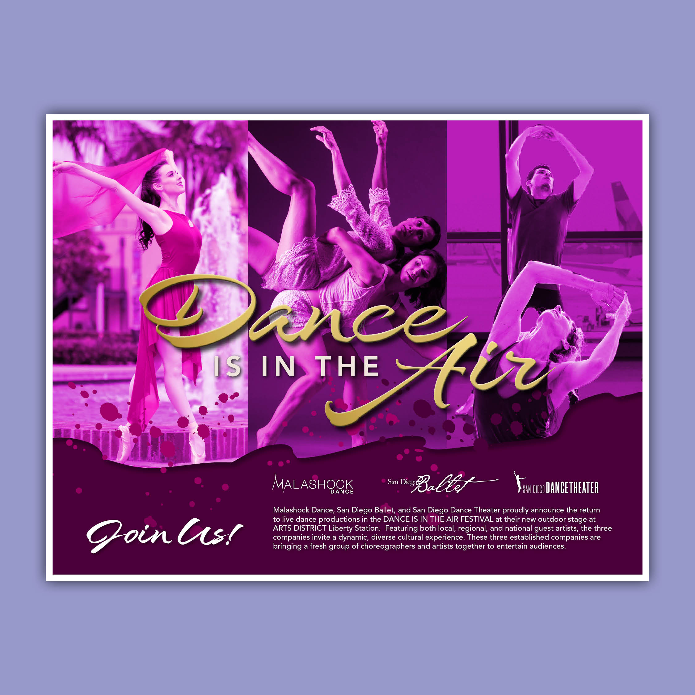
Dance is all about movement and creativity so this design we created for Malashock Dance for their spring event alludes movement through photos, text treatment and an energetic color palette. Why brand this at all? We wanted to give them a solid foundation for their first event and future events by giving them a strong visual look from the start.
Tags: holidays, labor day
Happy Labor Day!
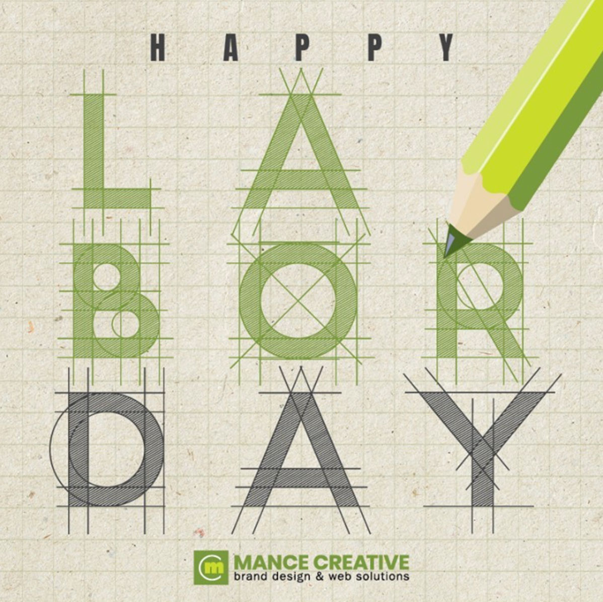
Happy Labor Day!
From everyone at your favorite design team.
A State-of-the-Art Upgrade!

We’ve been working with one of our top clients, Integra International, for six years and counting! Last year, Integra International revamped their brand and needed a website to match. We built a brand new site to meet their growing needs, including an in-depth “Find a Firm” search function that allows their global community of members to quickly and easily find partner firms all over the world. This was an essential feature to ensure their new site supported their mission and their brand, allowing their members to find collaborators by searching by name, industry, or geolocation with a few simple clicks.… Read More
Shades of Blue
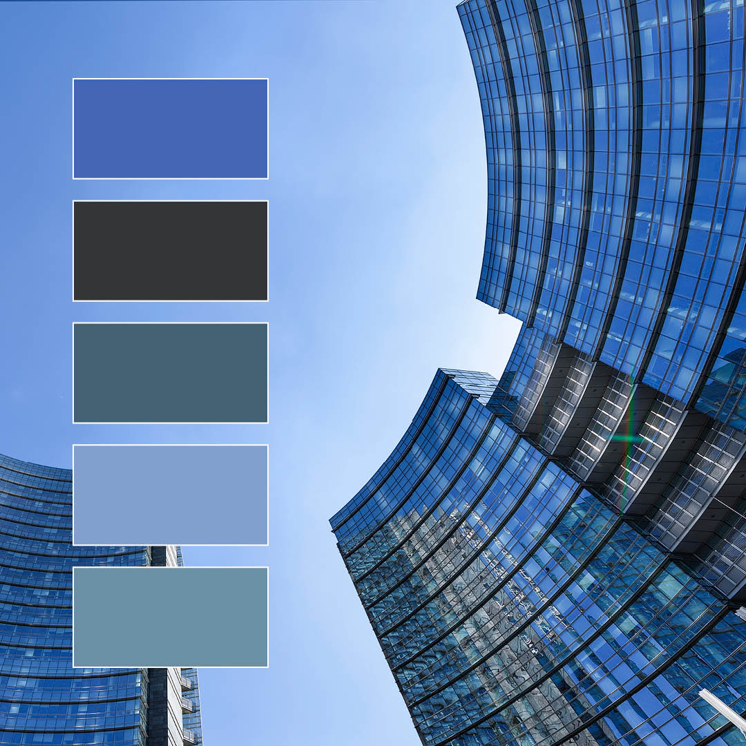
This blue color scheme may seem simple, but its diverse range of value makes for some serious eye candy! So, what makes it work so well? The darkest gray-blues contrast beautifully with the sun-filled sky just behind the building, and the varied hues that make up the building’s facade range from true blue to almost green in a naturally-occurring grid.
A color scheme like this is great for corporate entities, banks, or any brand aiming to communicate trust and reliability. Felt near-universally to be calm and stable, blue sets your brand apart as approachable and dependable; an especially useful tool … Read More
A Fresh New Look
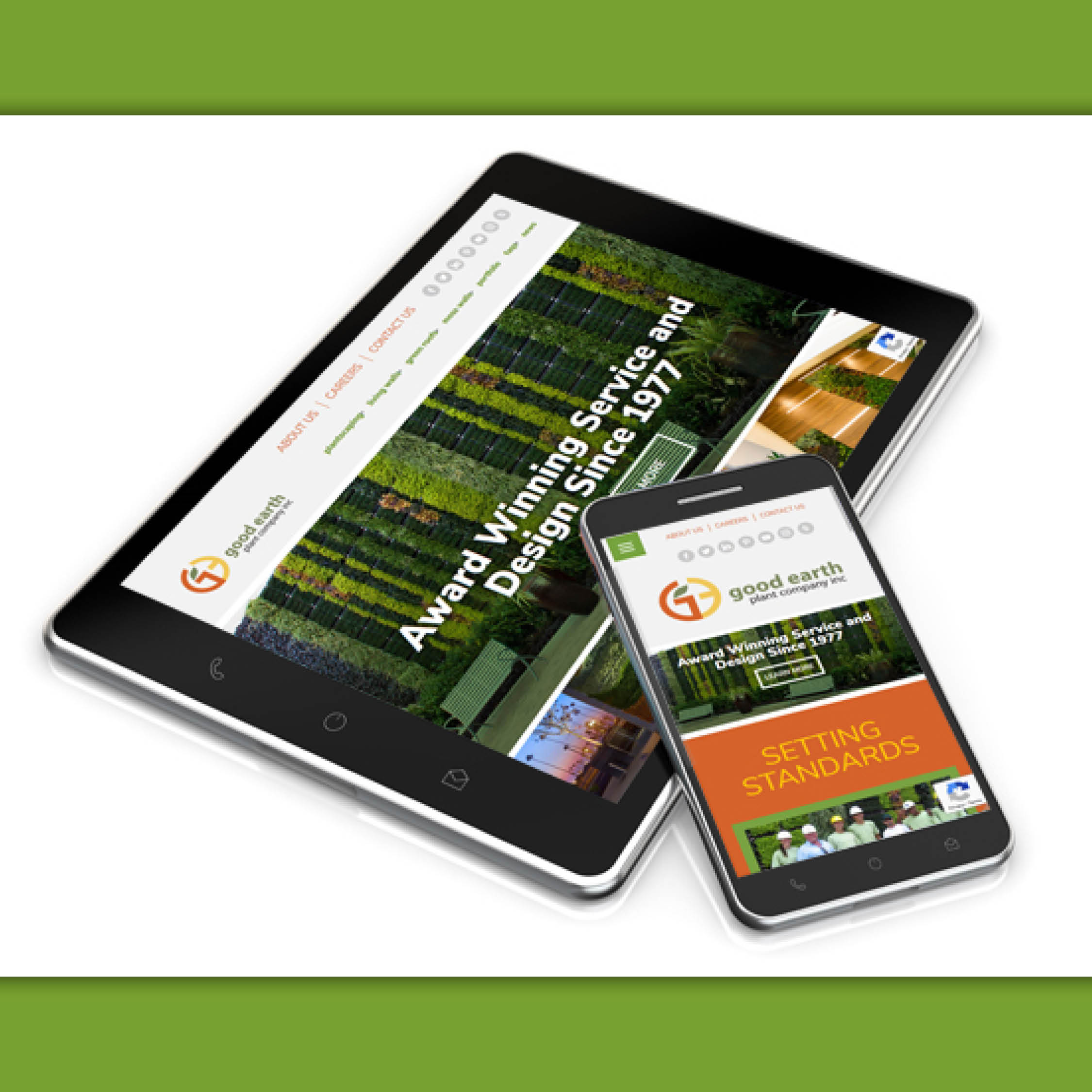
Websites – it’s what we do!
Organization & accurate representation was our theme when we revamped the website for our client Good Earth Plant Company. Our team designed a highly intuitive site with a clearly organized online portfolio making it easy for users to navigate. The addition of mobile coding translates that beauty and organization across all platforms, allowing Good Earth Plant Company to accurately exhibit its stunning, 40-year portfolio to a new generation of clients. Check them out at goodearthplants.com!
Happy Independence Day!
Happy Independence Day from all of us here at Mance Creative!
Shades of Green
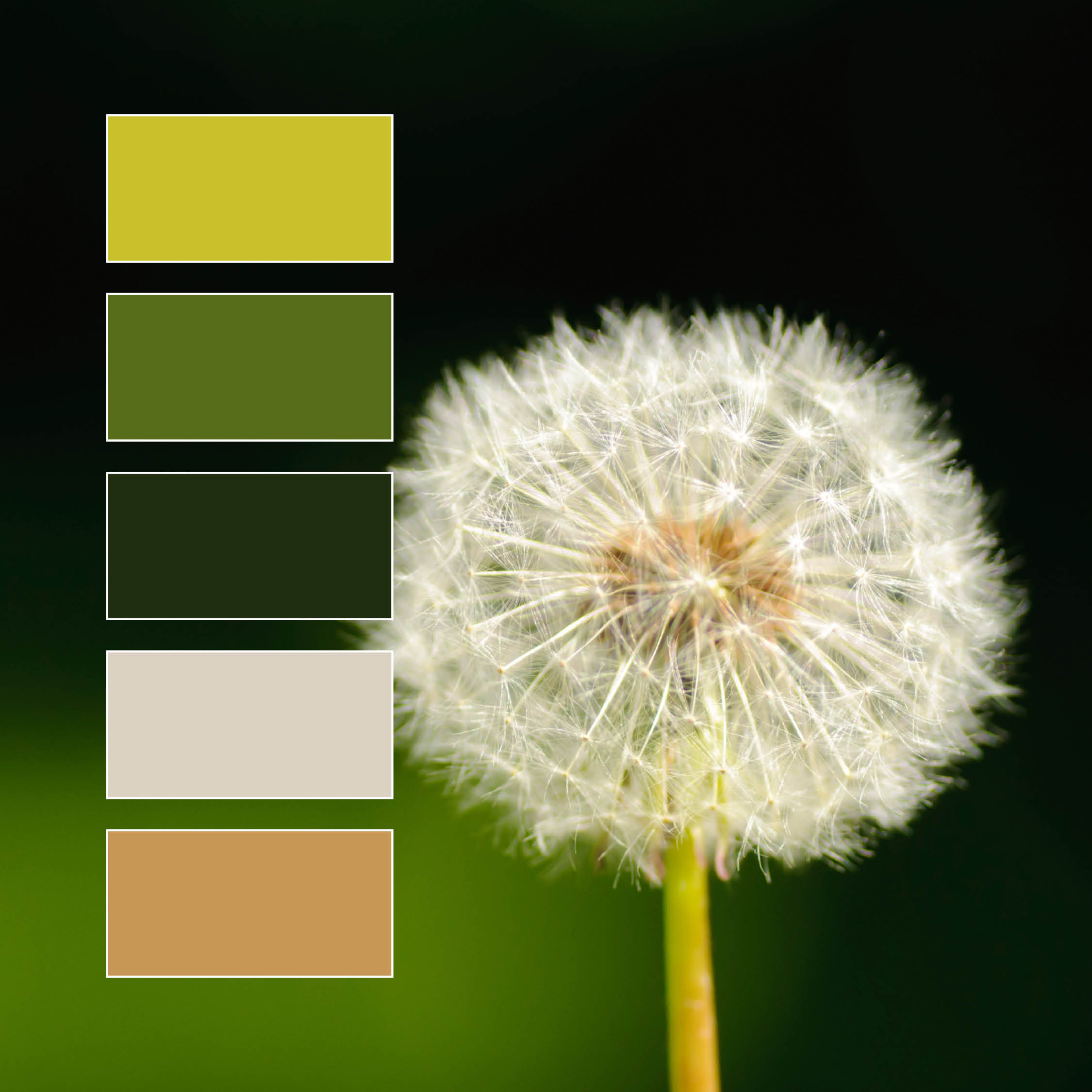
We love this color palette! While its made of mostly greens, a wide variety of shades and hues provides plenty of diversity and interest to the overall image. The bright camel and dusty white create strong contrast with the chosen greens, with each color sharing a subdued quality that highlights the natural harmony of the composition.
While green is on the cool end of the spectrum, its “temperature” is unique due to its status as a secondary color between two primaries; yellow and blue. This means the temperature of a green hue will vary greatly depending on which primary color … Read More
Design Tips: Color in Branding & Marketing
Why Green Should Be Your New Favorite Color!
The next color in our Design Tips: Color Themes series is our personal favorite; GREEN! Okay, maybe we’re a little bias, but there’s a good reason our Creative Director [Michael Mance] chose a monochromatic green color palette for Mance Creative. “Men tend to like cooler colors while women tend to like warmer colors. The color that they both agree on is green.” So, green was chosen to appeal to the widest possible audience. In addition to being equally eye-catching regardless of gender, green communicates balance, freshness, and innovation — All qualities we … Read More