A Fresh Start
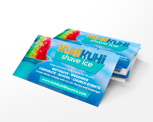
Founded in 2012, KuhiKuhi Shave Ice is a family-owned, shaved ice catering business based in Chula Vista, CA specializing in authentic, Hawaiian shaved ice made from all-natural ingredients. They have several mobile carts available for corporate, family and other social events, and are especially dedicated to providing fund-raising events to support the educational needs of the local community.
The current owner of KuhiKuhi Shave Ice bought the company from the previous owner and wanted to rebrand it to reflect her unique look and style. Because the company caters events and doesn’t have a brick-and-mortar store, everything depends on their branding … Read More
Our Values
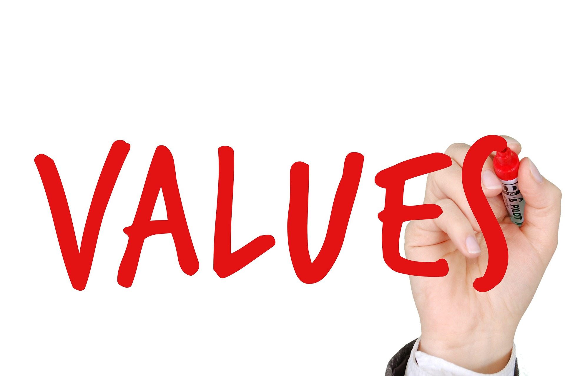
At Mance Creative, we believe in crafting meaningful and engaging designs that not only serve a purpose but also inspire joy, wonderment, and excitement. Our six core values – FUN, PARTNERSHIP, EXCELLENCE, TRUST, INNOVATION, and MAGIC – guide us in our approach to design and reflect our commitment to delivering exceptional work to our clients.
FUN – We believe that having fun is essential to our work. We inject a sense of playfulness and enthusiasm into every project we undertake, and we encourage our clients to do the same. Our goal is to create designs that are not only effective … Read More
Tags: Asperand, Design, Mance Creative
Here’s Lookin @ You!
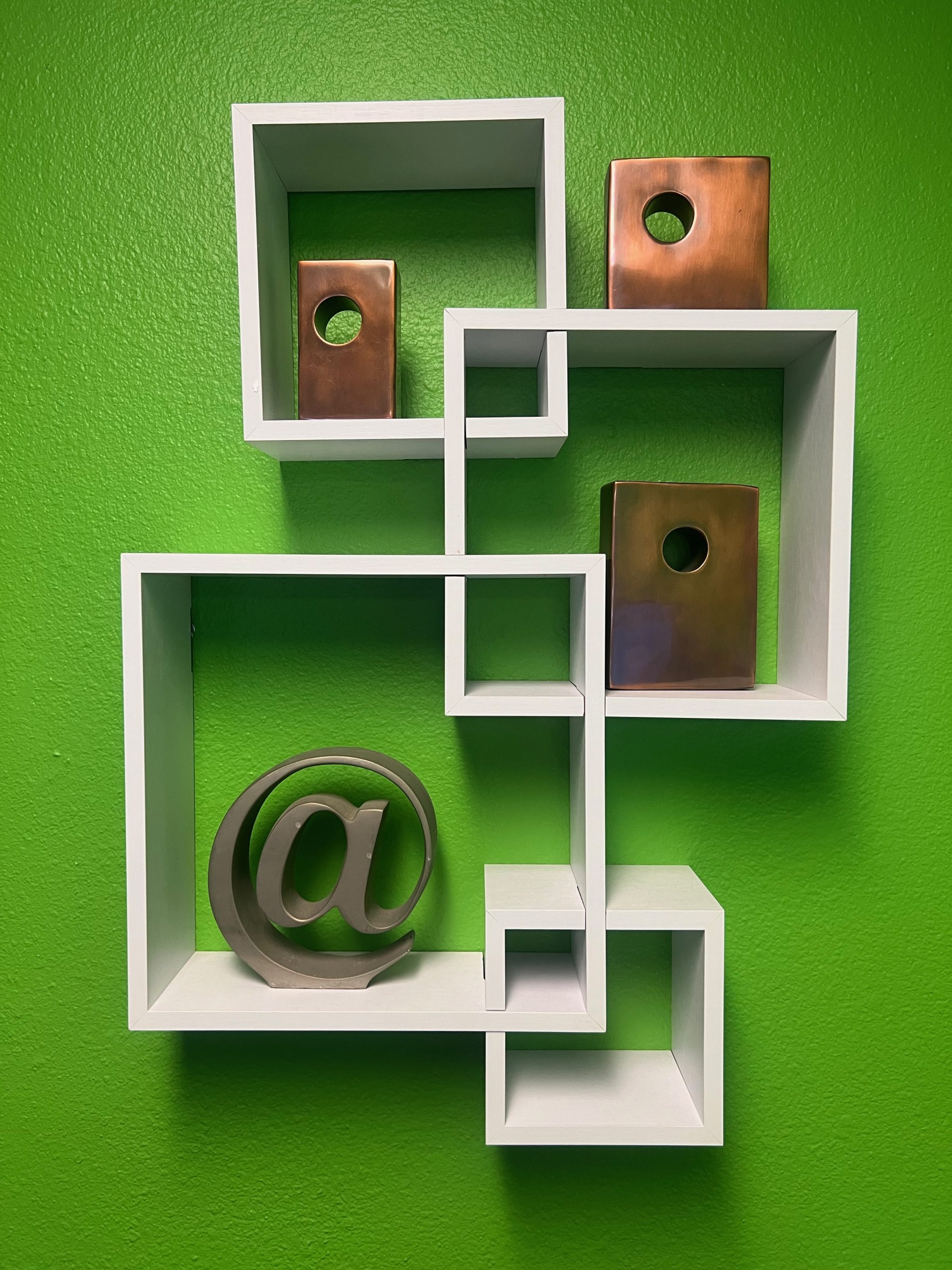
As you enter the Mance Creative offices, you might notice this sculpture of the asperand on our shelf. The asperand (@ symbol) is commonly used today as the “at” in emails and on social media platforms, but its roots are fairly old.
It’s first known use dates to the 16th century when merchants used it to indicate the price per unit of something sold. So if wine was being sold at $12 per bottle, it would be “$12 @ bottle”.
The @ symbol fell out of common use for a while until computer programmer, Ray Tomlinson, needed an uncommonly used … Read More
Tags: Asperand, Design, Mance Creative
Here’s Lookin @ You!
As you enter the Mance Creative offices, you might notice this sculpture of the asperand on our shelf. The asperand (@ symbol) is commonly used today as the “at” in emails and on social media platforms, but its roots are fairly old.
It’s first known use dates to the 16th century when merchants used it to indicate the price per unit of something sold. So if wine was being sold at $12 per bottle, it would be “$12 @ bottle”.
The @ symbol fell out of common use for a while until computer programmer, Ray Tomlinson, needed an uncommonly used … Read More
Tags: Green, ManceCreative, WebDesign
The Power of Color: Green
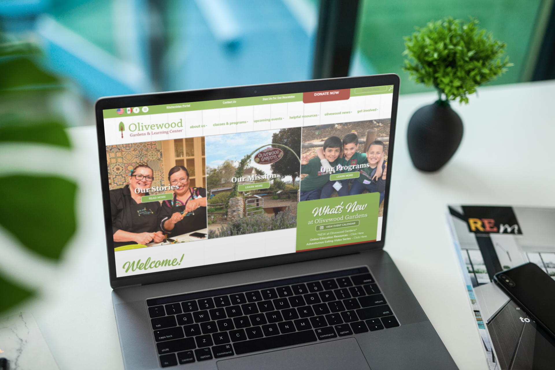
💚Green is more than just a color, it’s a symbol of growth, renewal, and harmony. At Mance Creative, we understand the power of color and how it can shape the perception of your brand. That’s why we always consider the impact of color when designing logos, websites, and marketing materials for our clients, just like we did for Olive Wood Garden’s website. Let us bring your brand to life with the perfect color palette! #ManceCreative #OliveWoodGardens
Event Branding and Messaging
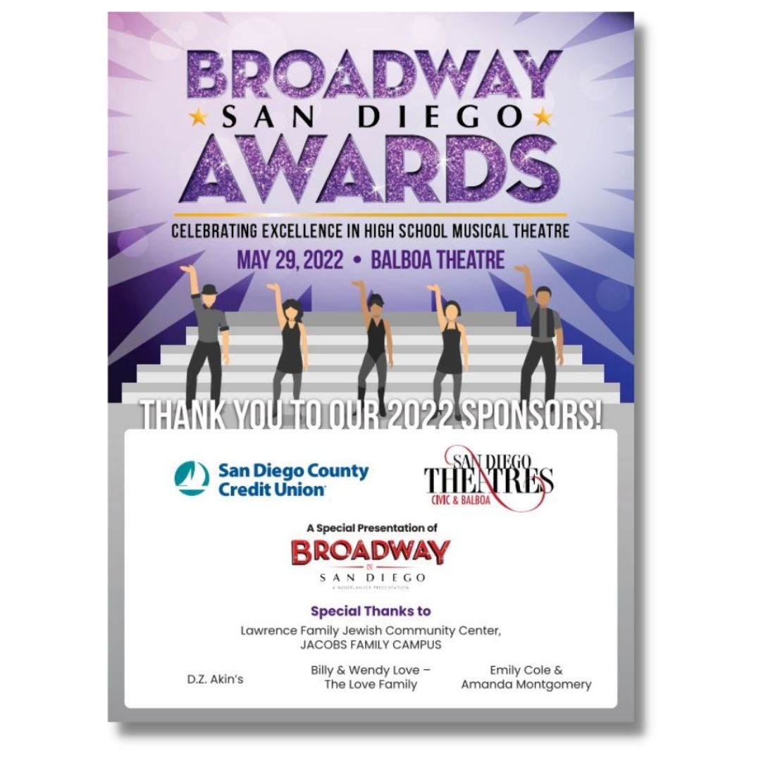
Check out the sponsor graphic we created for the Broadway San Diego Awards, a local high school musical theatre competition. Event signage is so important to convey your messaging and here we can clearly see who sponsored this amazing event. Our President and Creative Director at Mance Creative got to participate as a guest judge too! Congrats to the winners who will go on to represent San Diego at The National High School Musical Theatre Awards, also known as The Jimmy Awards, in New York this June!
WEBSITE REFRESH
The new Malashock Dance website is LIVE! We had so much fun working on version 2.0 – we designed their last website 5 years ago. We kept the color palette consistent with their branding, but this time around chose bolder, richer tones. We included an updated hero video to evoke movement and showcase their dance performances. Looking to update your website? Contact us today!
Key Art Design
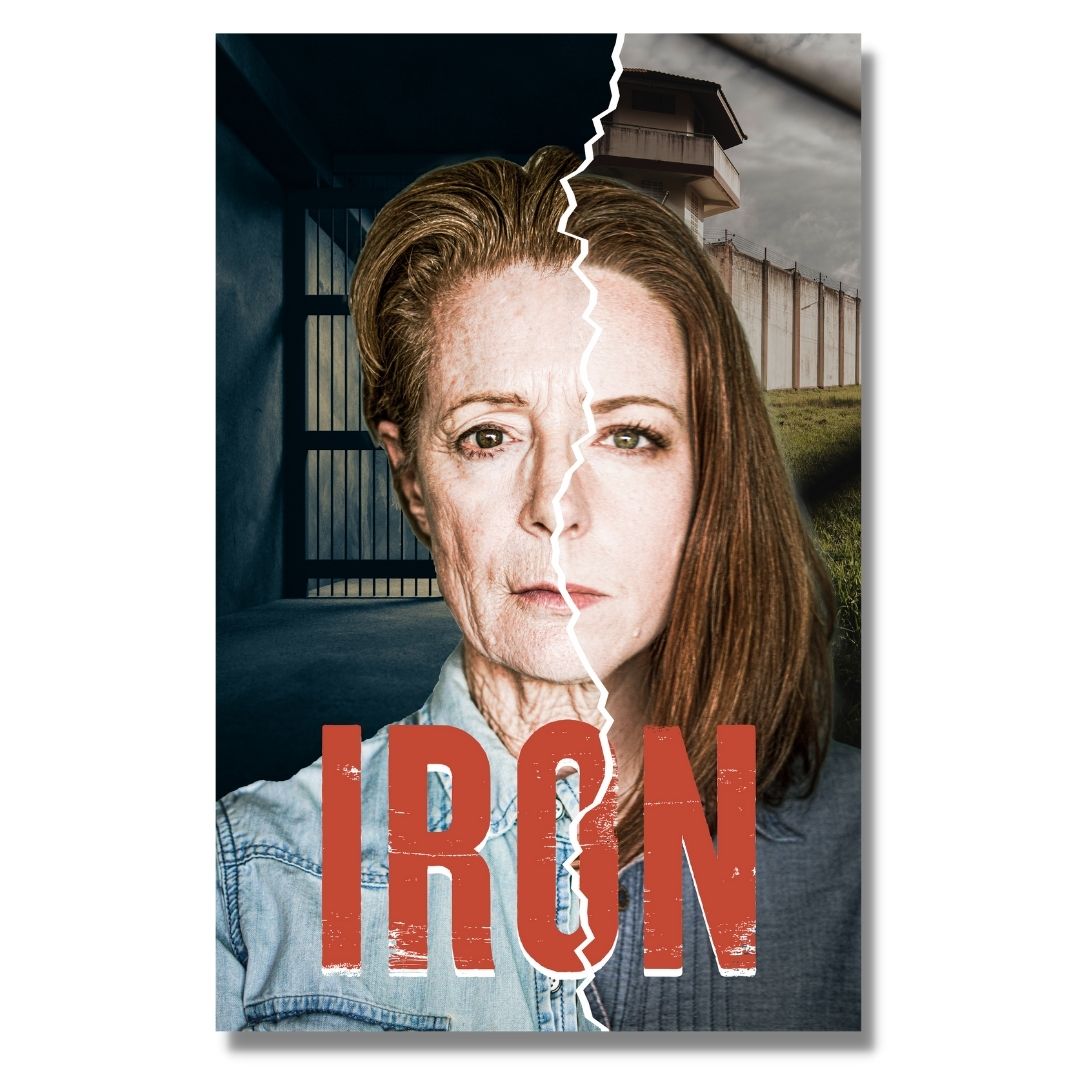
We’re excited to share original key art we designed for Roustabouts Theatre’s West Coast premier of IRON! With the main characters portrayed by real-life mother/daughter team Rosina Reynolds and Kate Rose Reynolds, we had the unique opportunity to explore a variety of exciting designs that toyed with the actresses’ stark resemblance. The final design presents the characters as two halves of one portrait; an homage to the nuance of the mother-daughter bond portrayed throughout the play, as well as the fracturing circumstances at the epicenter of the story. Check out their show schedule at theroustabouts.org and learn more about … Read More
Internal Marketing Collateral
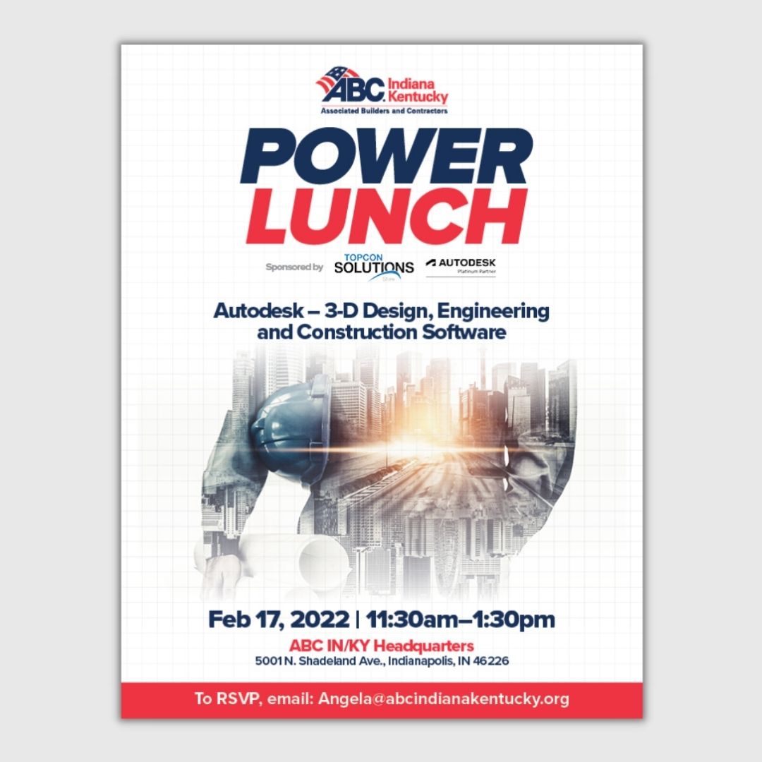
Your internal marketing materials are just as important as your client and customer-facing initiatives. Why? Because they reinforce your brand, mission, and values to the people who make up your company! Make sure your employee handbooks, reference materials, and event flyers (like this one we designed for ABC Indiana/Kentucky’s networking Power Lunch) speak to not only your people, but also your brand. Ready to take your marketing materials to the next level? Contact us today using the form on our website to get started!
Website Launch!
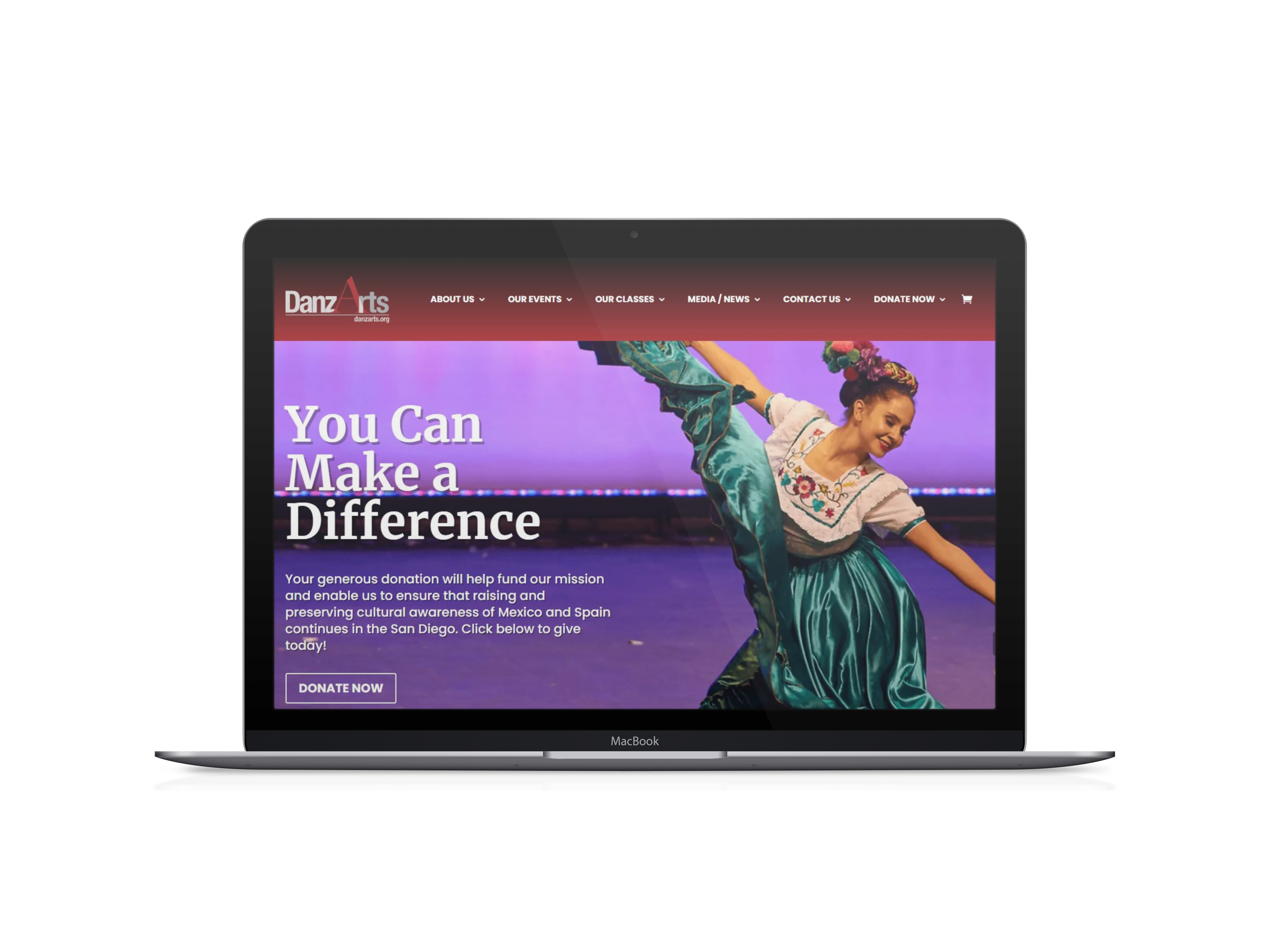
We’re excited to announce DanzArts’ new website is officially LAUNCHED! Featuring a brand new look and completely overhauled back-end system, their new site is ready to offer more exciting features, receive more traffic, and ultimately advance their mission by connecting more members of the San Diego community with their organization. Check out their new site at danzarts.org and make sure to check back in to see them featured in our Case Studies.